WPF 下的自定义控件以及 Grid 中控件的自适应
本文主要总结使用 C# 及 .NET 在 WPF 框架下,自定义控件的绘制以及窗体中控件的自适应。
1. WPF 下的自定义控件
WPF 下,为快速地为应用定制一个零部件,需要的是 UserControl , 为了让你打造的控件更标准化,更灵活以及更具有普遍意义,需要用到的 CustomControl 。要在 WPF 中自定义一个控件,使用 UserControl 与 CustomControl 都是不错的选择,他们的区别在于:
UserControl , 其更像 WinForm 中自定义控件的开发风格,在开发上更简单快速,几乎可以简单地理解为:利用设计器来将多个已有控件作为子元素来拼凑成一个 UserControl 并修改其外观,然后后台逻辑代码直接访问这些子元素。其最大的弊端在于: 其对模板样式等支持度不好,其重复使用的范围有限。
CustomControl , 其开发出来的控件才真正具有 WPF 风格,其对模板样式有着很好的支持,这是因为打造 CustomControl 时做到了逻辑代码与外观相分离,即使换上一套完全不同的视觉树其同样能很好的工作,就像 WPF 内置的控件一样。
在使用 Visual Studio 打造控件时 , UserControl 与 CustomControl 的差别就更加明显,在项目中添加一个 UserControl 时,我们会发现设计器为我们添加了一个 XAML 文件以及一个对应的 .CS 文件「或 .VB 等」,然后你就可以像设计普通窗体一样设计该 UserControl ; 如果我们是在项目中添加一个 CustomControl , 情况却不是这样,设计器会为我们生成一个 .CS 文件「或 .VB 等」,该文件用于编写控件的后台逻辑,而控件的外观却定义在了软件的应用主题「Theme」中了「如果你没有为软件定义通用主题,其会自动生成一个通用主题
themes\generic.xaml, 然后主题中会自动为你的控件生成一个 Style 」,并将通用主题与该控件关联了起来。这也就是 CustomControl 对样式的支持度比 UserControl 好的原因。
这里为了简便起见,使用 UserControl 创建自定义控件。
1.1 新建 UserControl
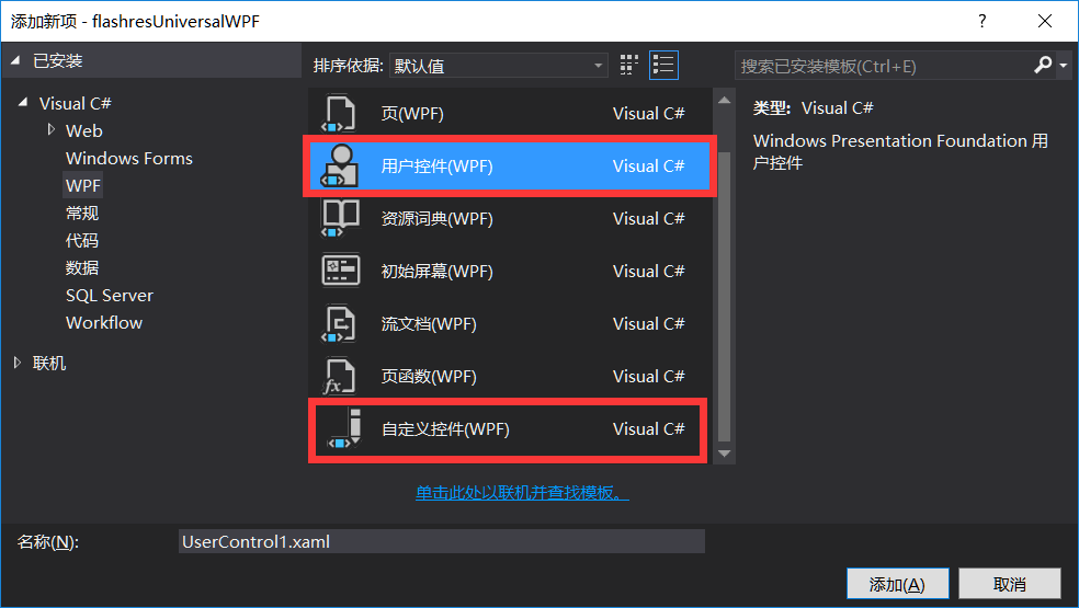
对项目点击右键,选择「添加」->「新建项」,选择 「用户控件『WPF』」”, 即可成功添加自定义控件。
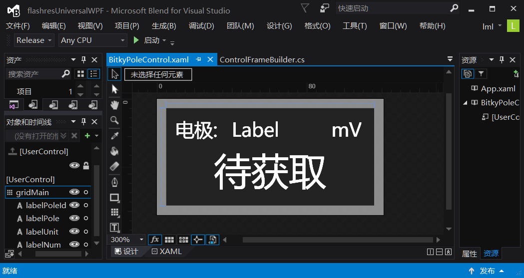
对该控件进行设计,拖入几个系统控件,并修改其参数即可。下图展示的是我使用 Microsoft Blend 设计对控件进行设计:
1.2 UserControl 的基本代码
控件设计完毕后,右键单击控件编辑窗口,选择「查看代码」,或直接按「F7」键,即可编辑该控件类的源代码。我主要添加了该控件的初始化,改变控件的背景颜色,以及动态设定控件显示的值等代码功能,具体如下:
1 | /// <summary> |
2. Grid 中控件的动态添加
2.1 主窗体中 Grid 的配置
我在主窗体中添加了一个 Grid , 并将该 Grid 平均分成了八行八列,如下图所示:
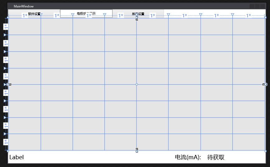
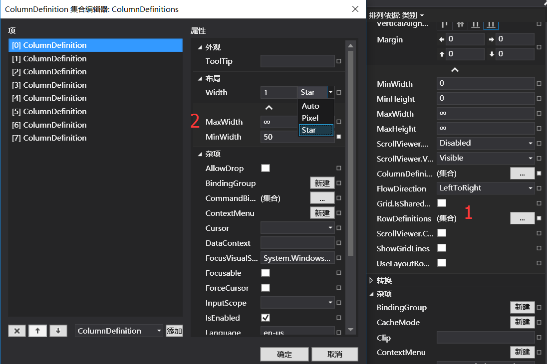
设置方法如下:如下图所示,通过对 Grid 的属性进行如下设置:
在「1」处,可添加 ColumnDefinitions 和 RowDefinitions 。
在「2」处,可设置 Grid 中单元格的最小尺寸,在 width 处,有三个选项:「Auto」,「Pixel」,「Star」。
- “Auto”:系统根据情况自动设定尺寸。
- “Pixel”:设定为绝对尺寸,无法自适应。
- “Star”:设置比重,各个行或列按照设定的比重分配Grid的空间。
在此,为了平均分配 Grid 的空间,且可根据窗口大小自适应,故将所有行和列的该项设定为「Star」,值设为「1」,即可出现上图的效果。
2.2 Grid 中动态添加控件
在主窗体类中使用如下代码即可在 Grid 中动态添加控件 :
1 | /// <summary> |
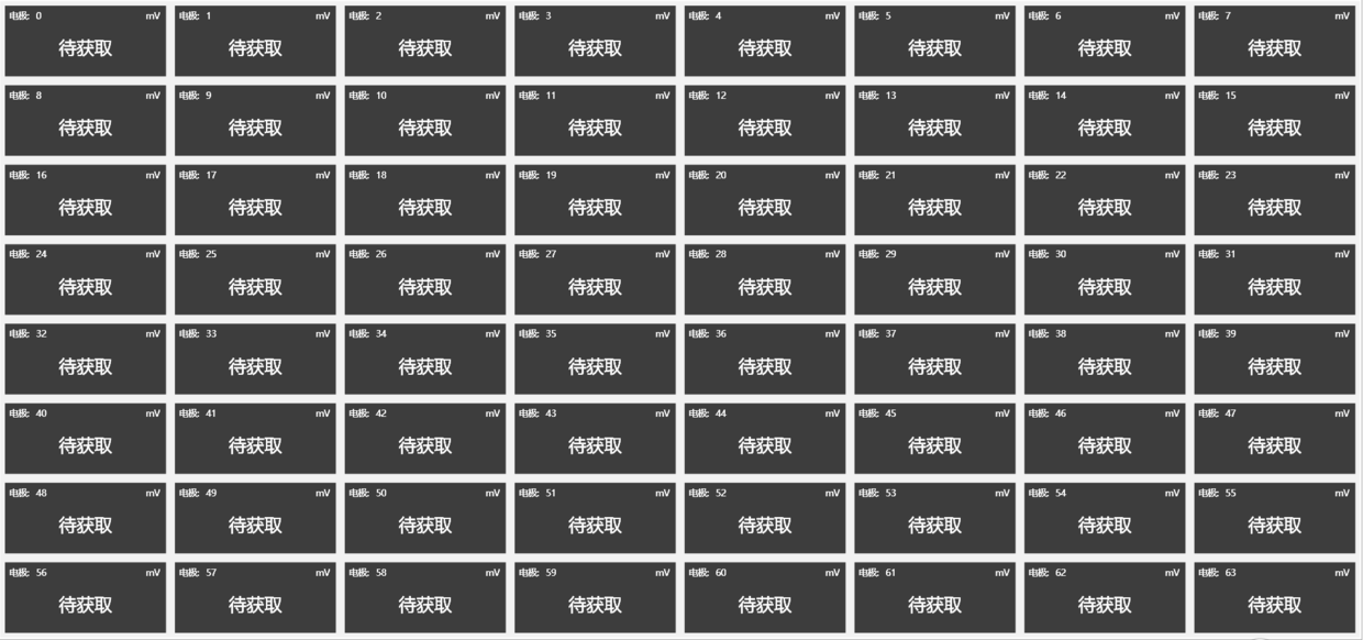
运行程序,效果如下图所示:
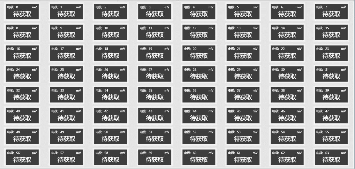
观察图片可知,空间排布较为美观,如若想要子控件完全填充 Grid 中的单元格,需对子控件的属性进行配置。
3. Grid 中子控件的动态自适应
3.1 对子控件的属性进行配置
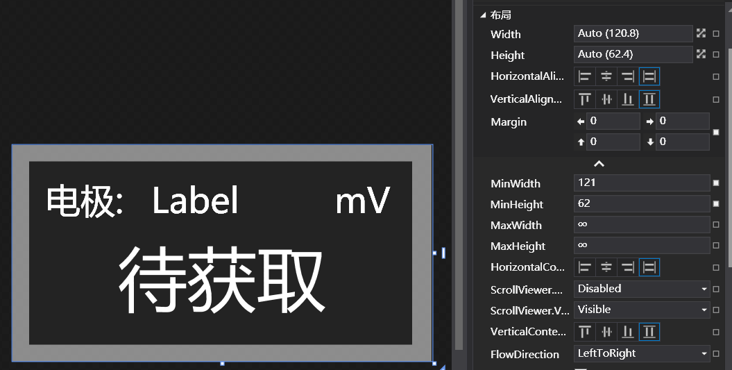
如图所示,将控件的宽度和高度设为「Auto」,将 HorizontalAlignment 和 VerticalAlignment 设为「Stretch」 , Margin 设为合适的值 , 则此时, Grid 中的子控件的即可动态自适应父控件。